Elgin
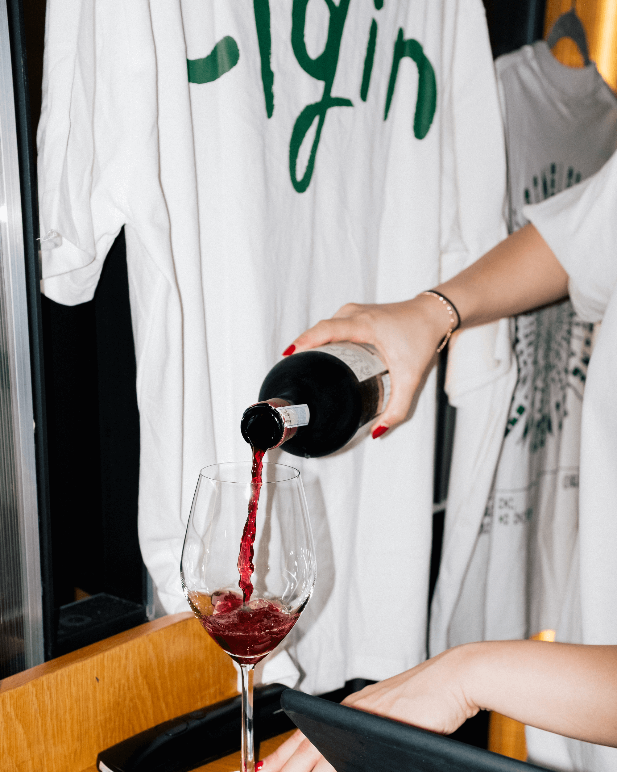
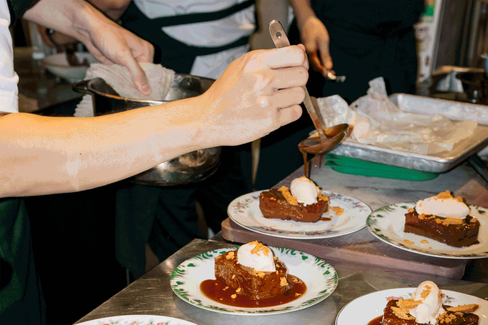
Elgin is a vibrant restaurant in Saigon, Vietnam, blending the warmth of bar-style service with the sophistication of restaurant dining. Their team reached out to me for a rebranding project aimed at creating a memorable brand identity that would leave a lasting impression.
The name Elgin pays homage to the street in Hong Kong where the founders first met. Each of them worked in different restaurants along this bustling avenue, surrounded by a diverse array of eateries.
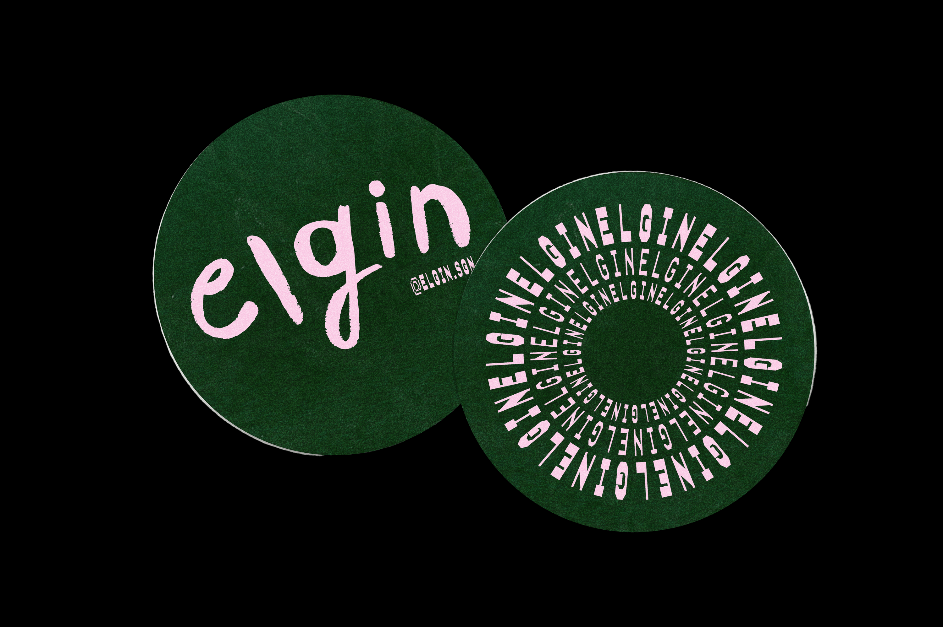
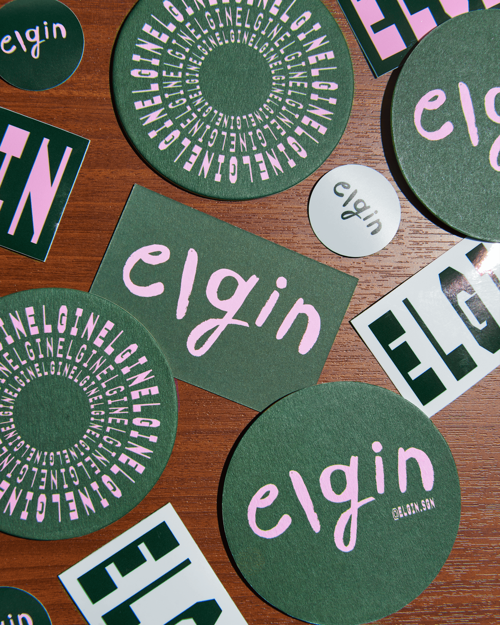
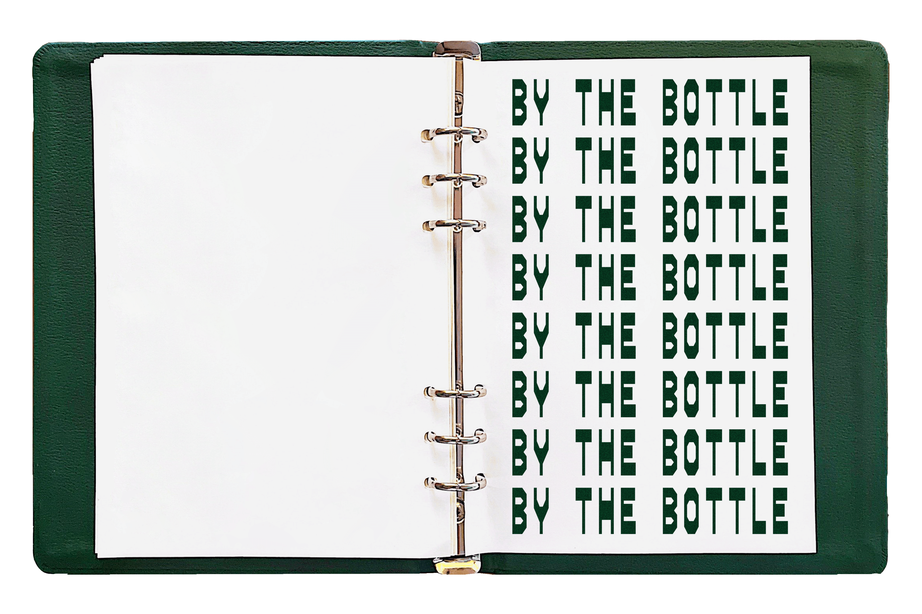
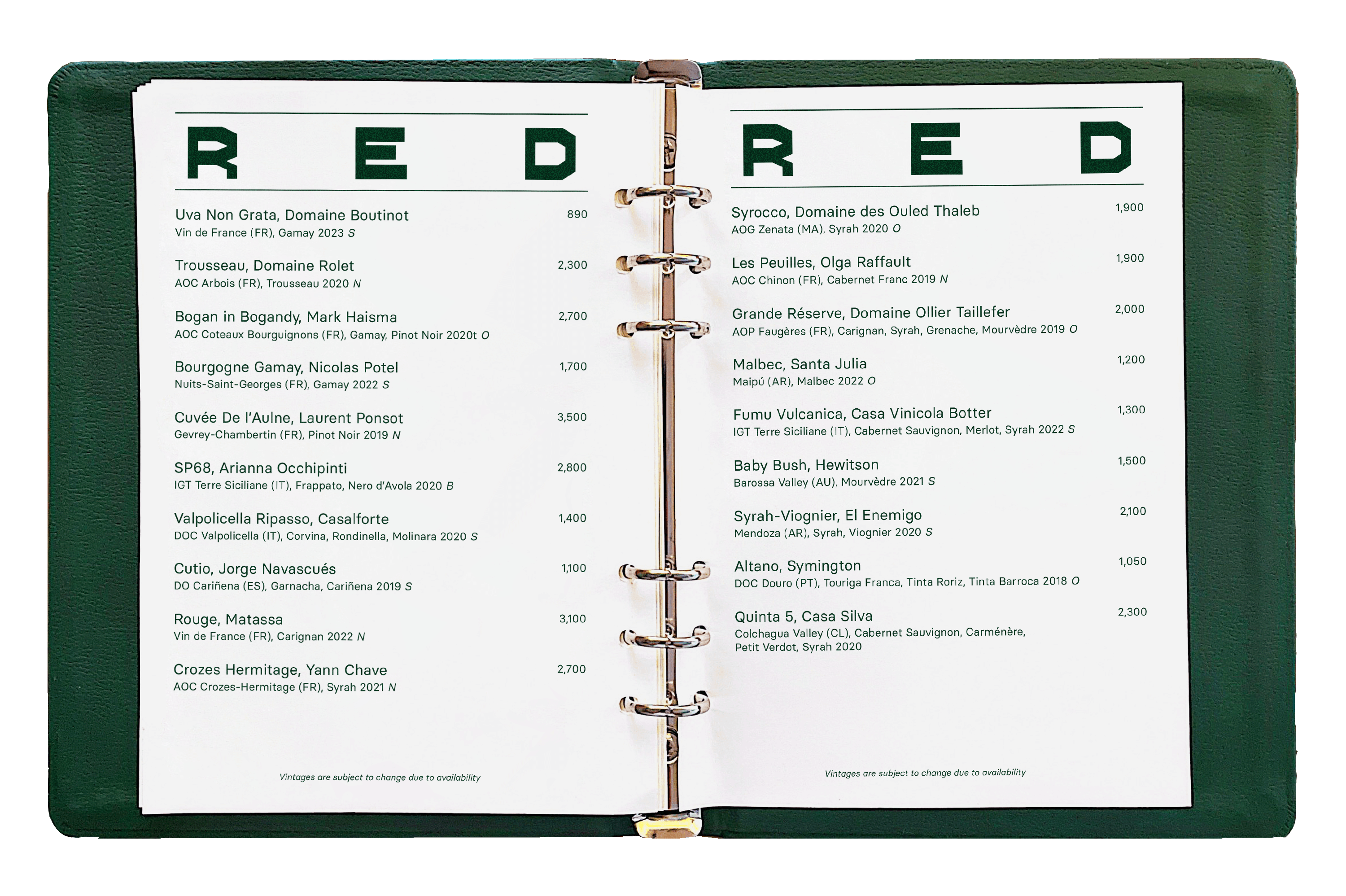
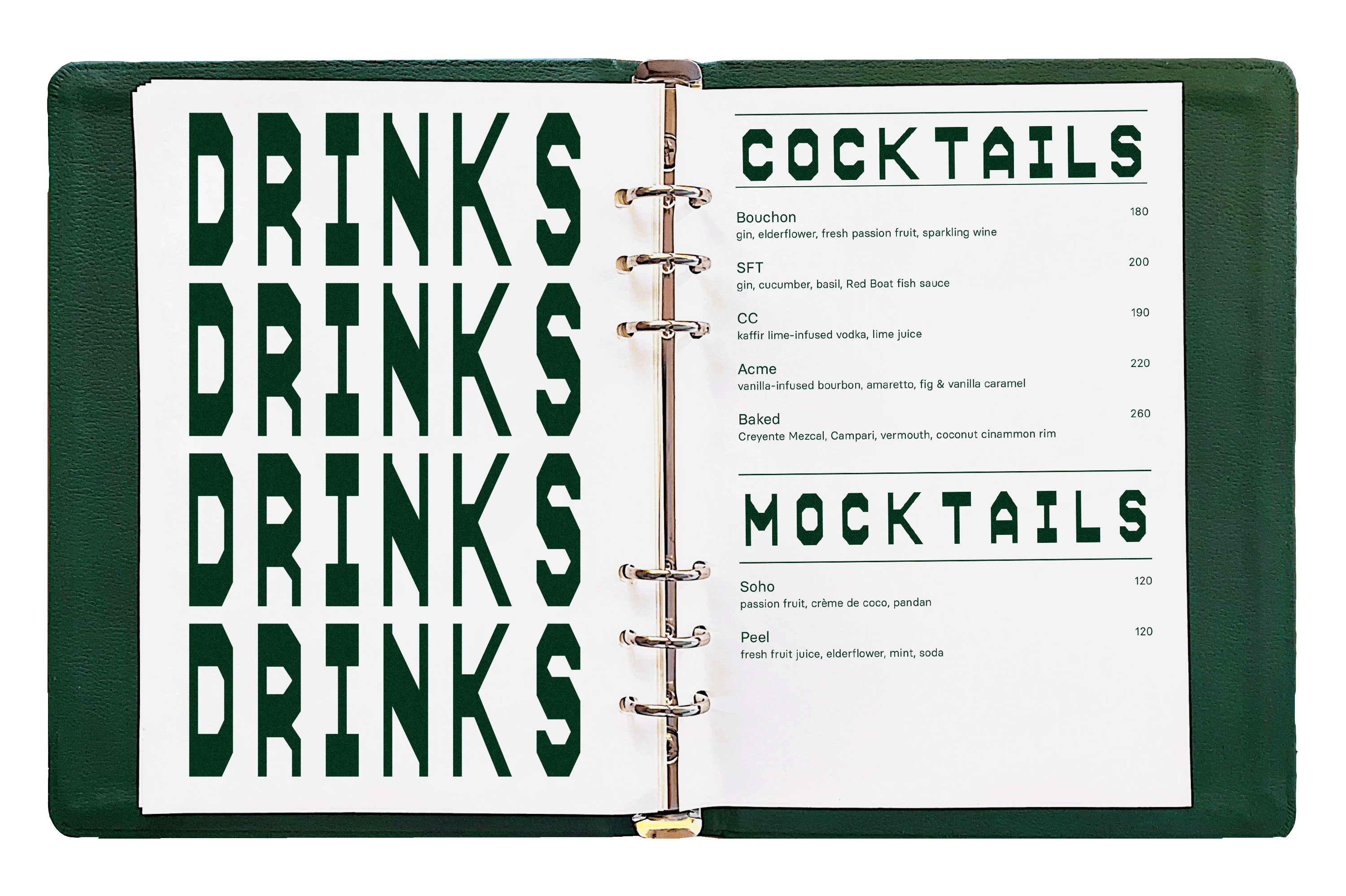
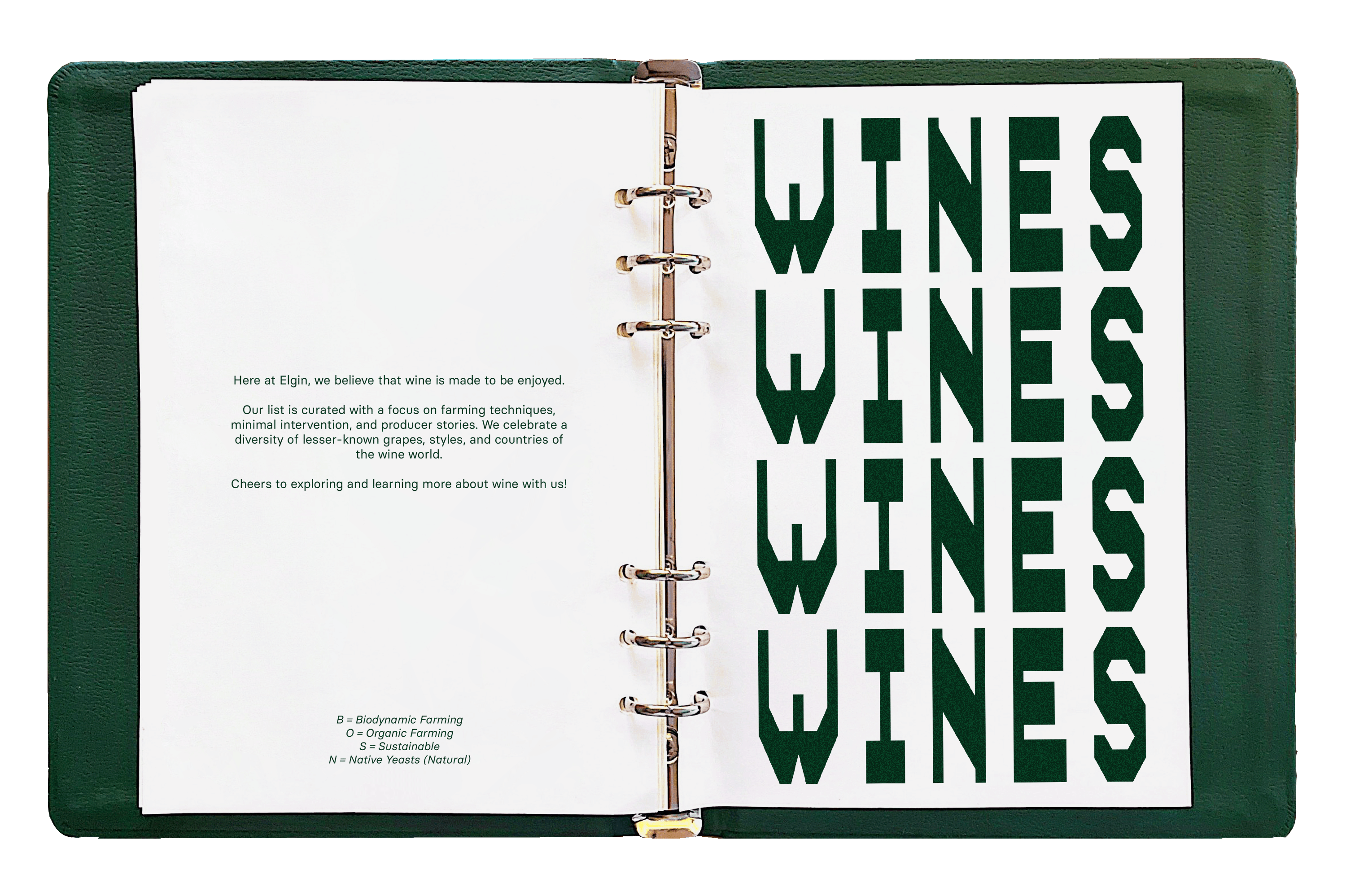
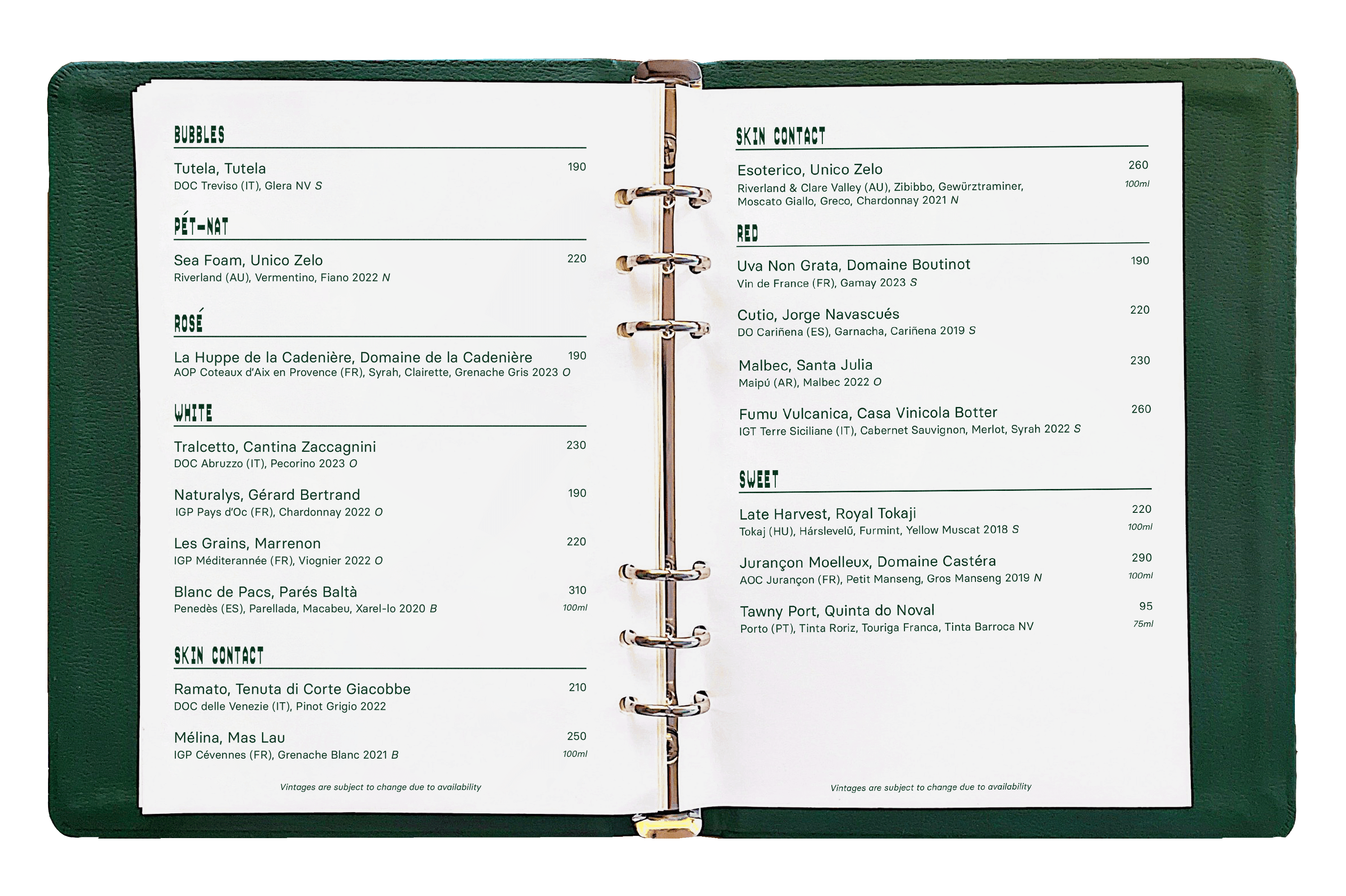
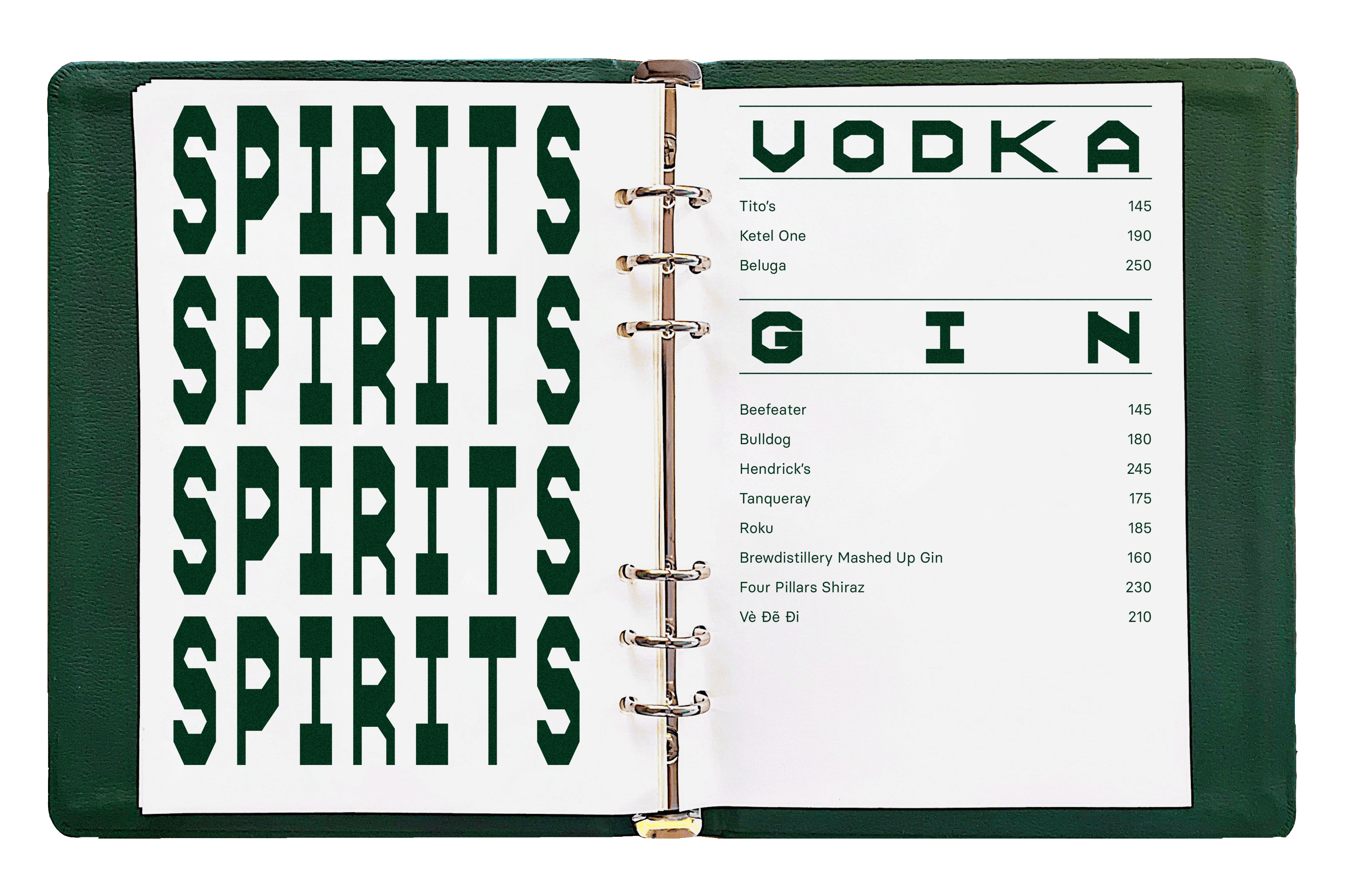
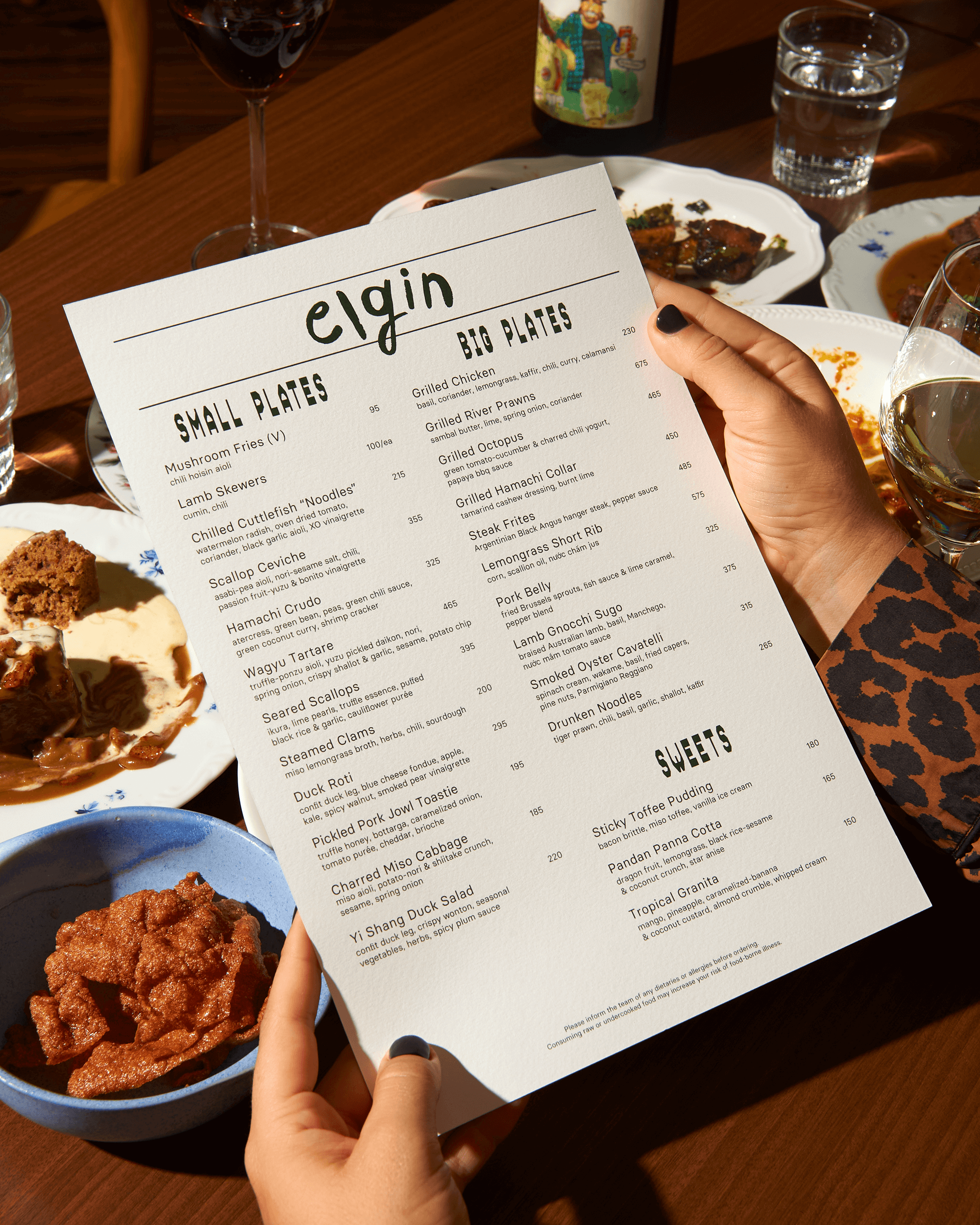
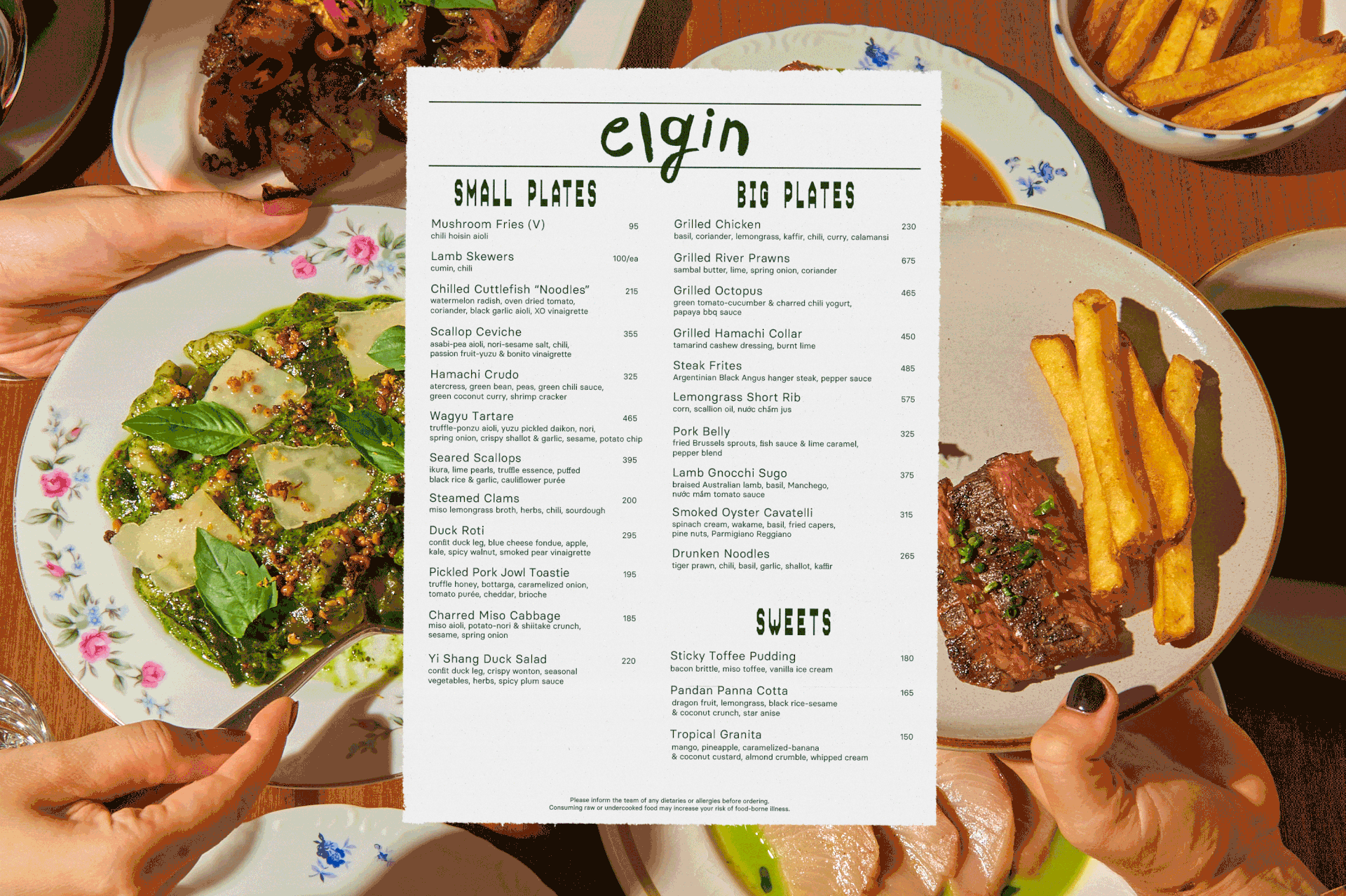
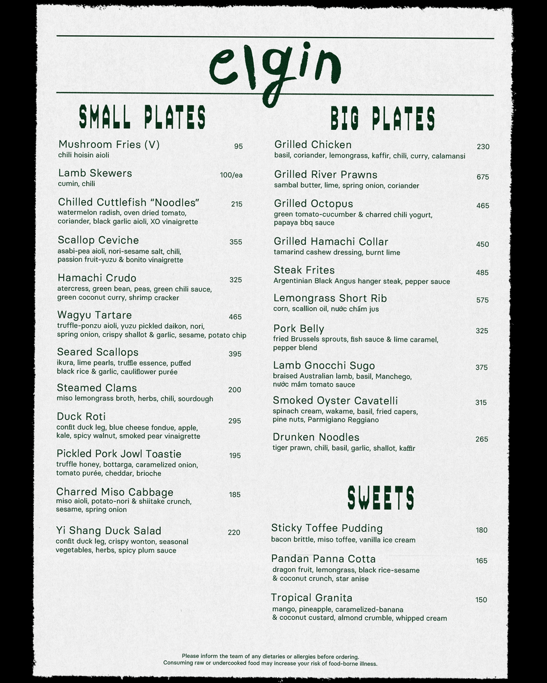
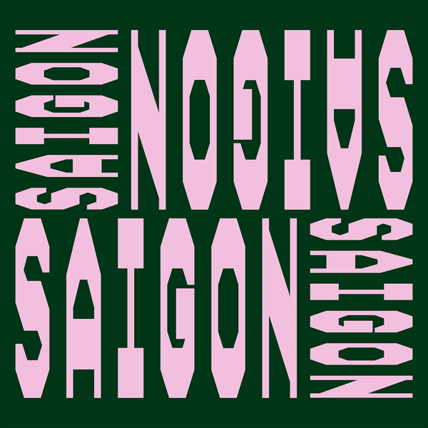
Said backstory is the foundation for Elgin’s new visual identity. The founders’ deep love and passion for hospitality shine through everything they do, leading me to frame Elgin as a celebration and homage to restaurant culture. The entire visual identity is centered around the layout of restaurant receipts.
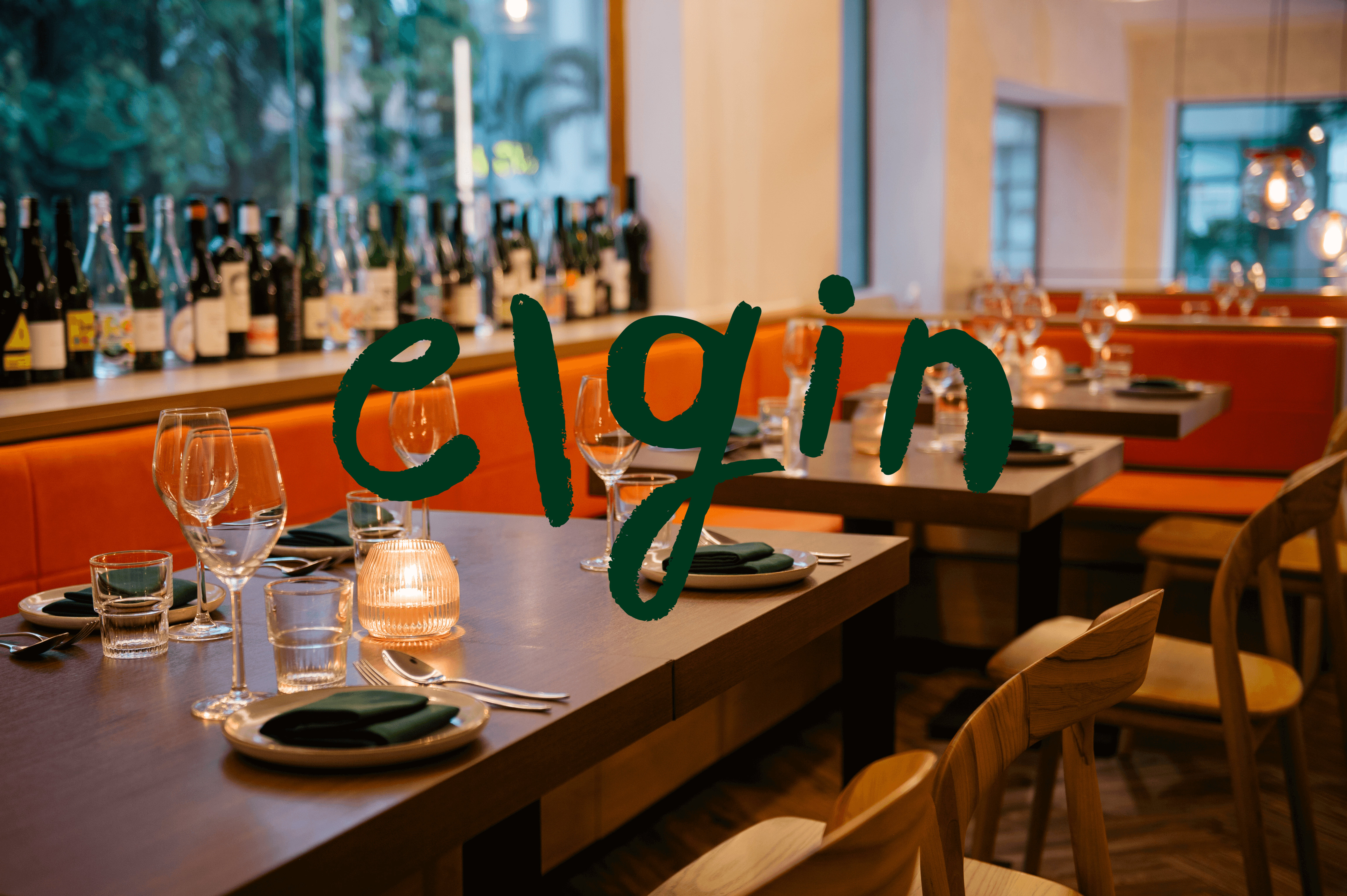
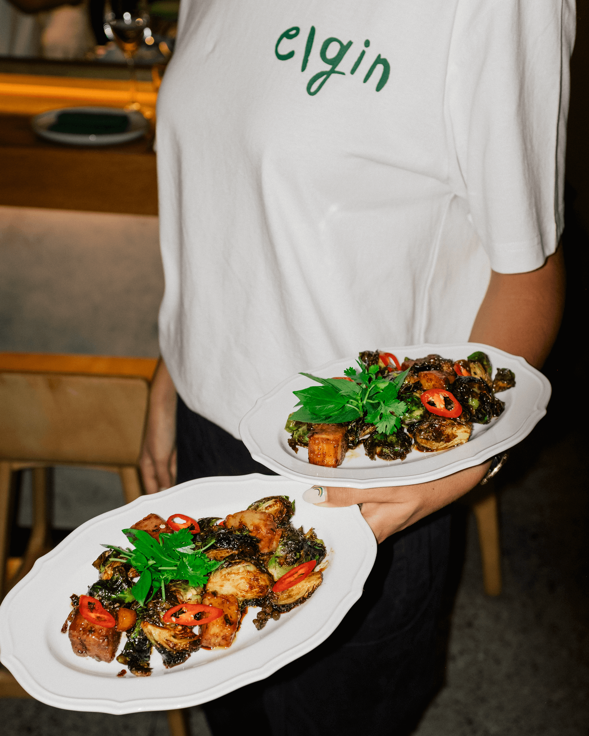
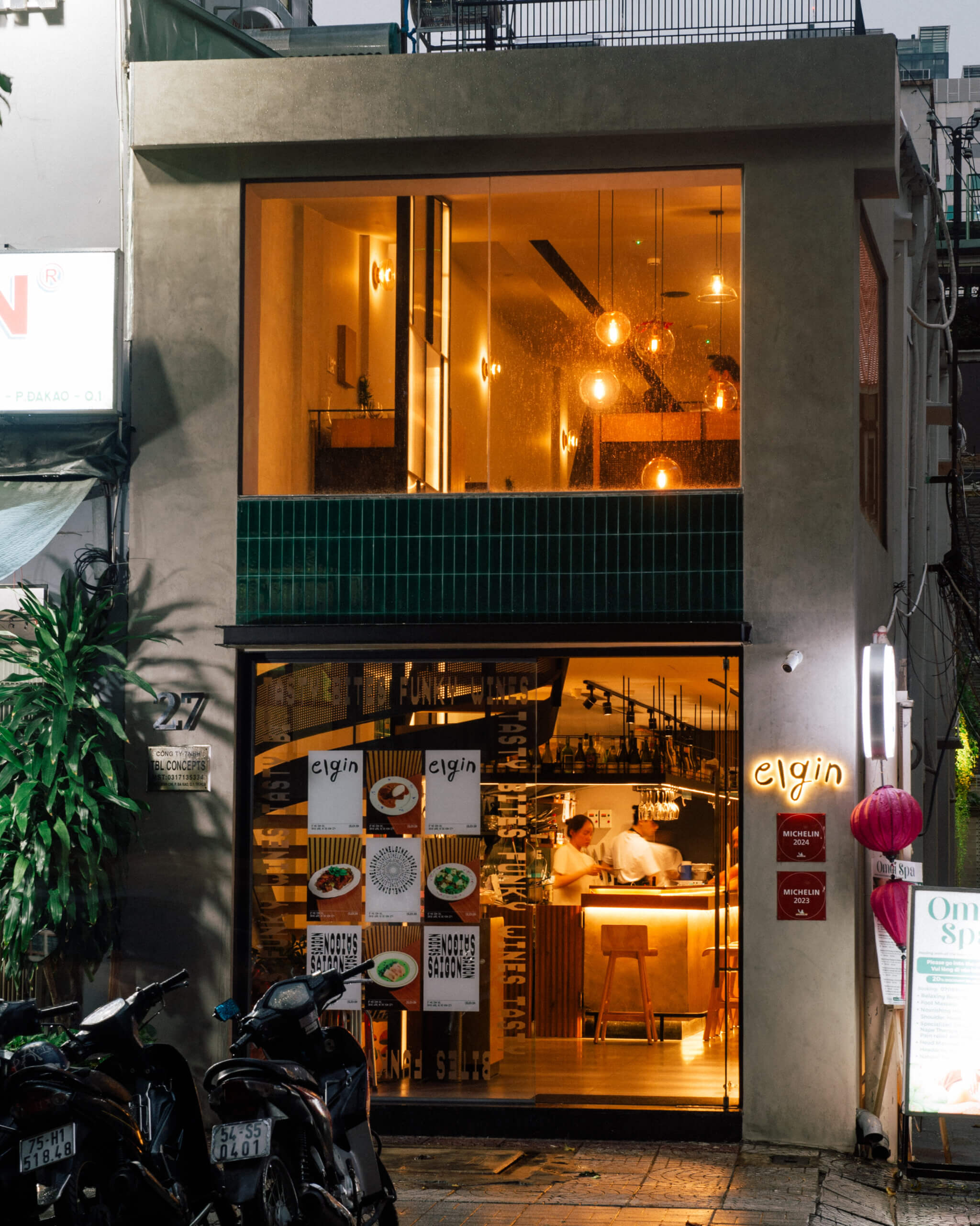
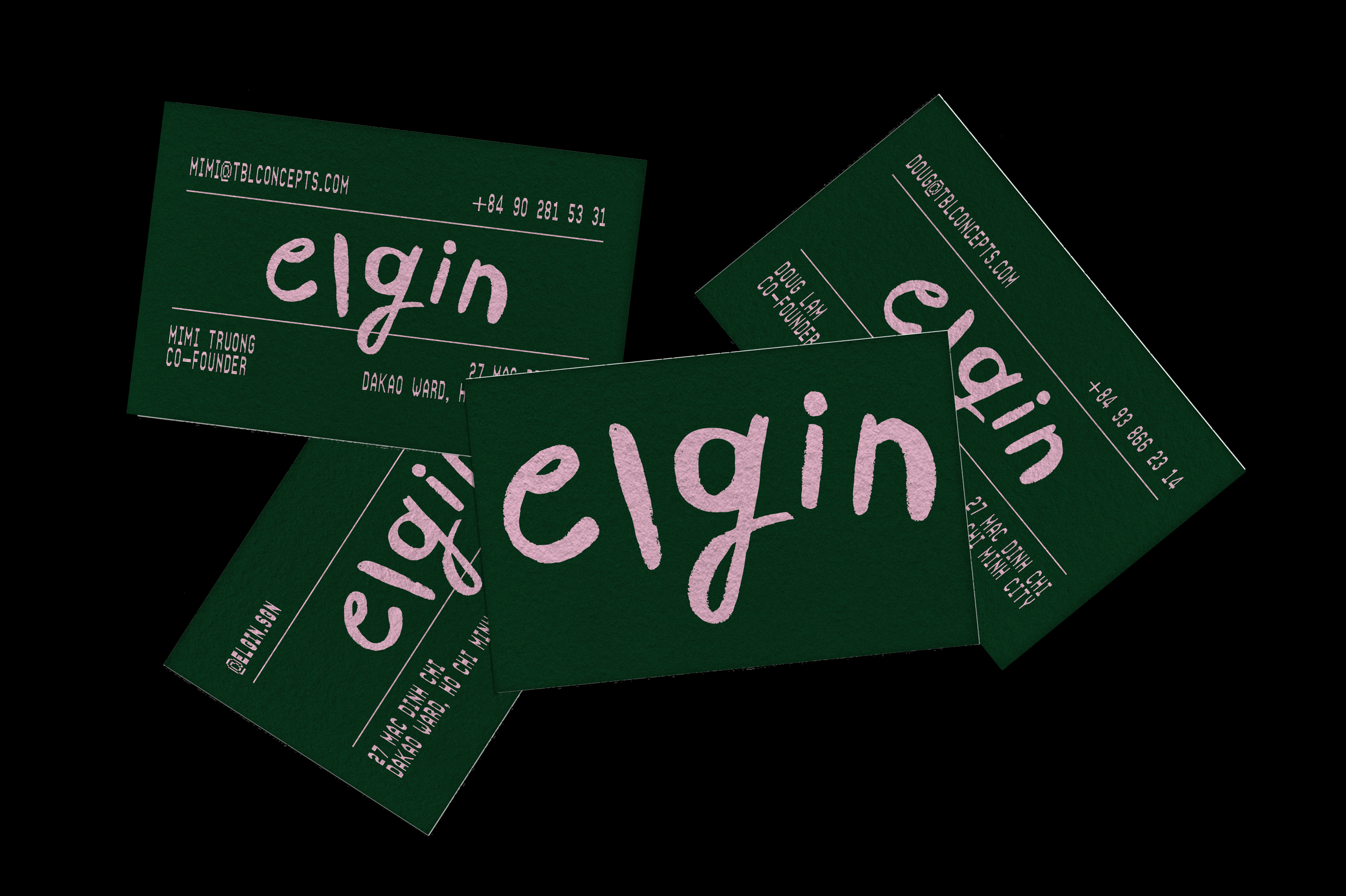
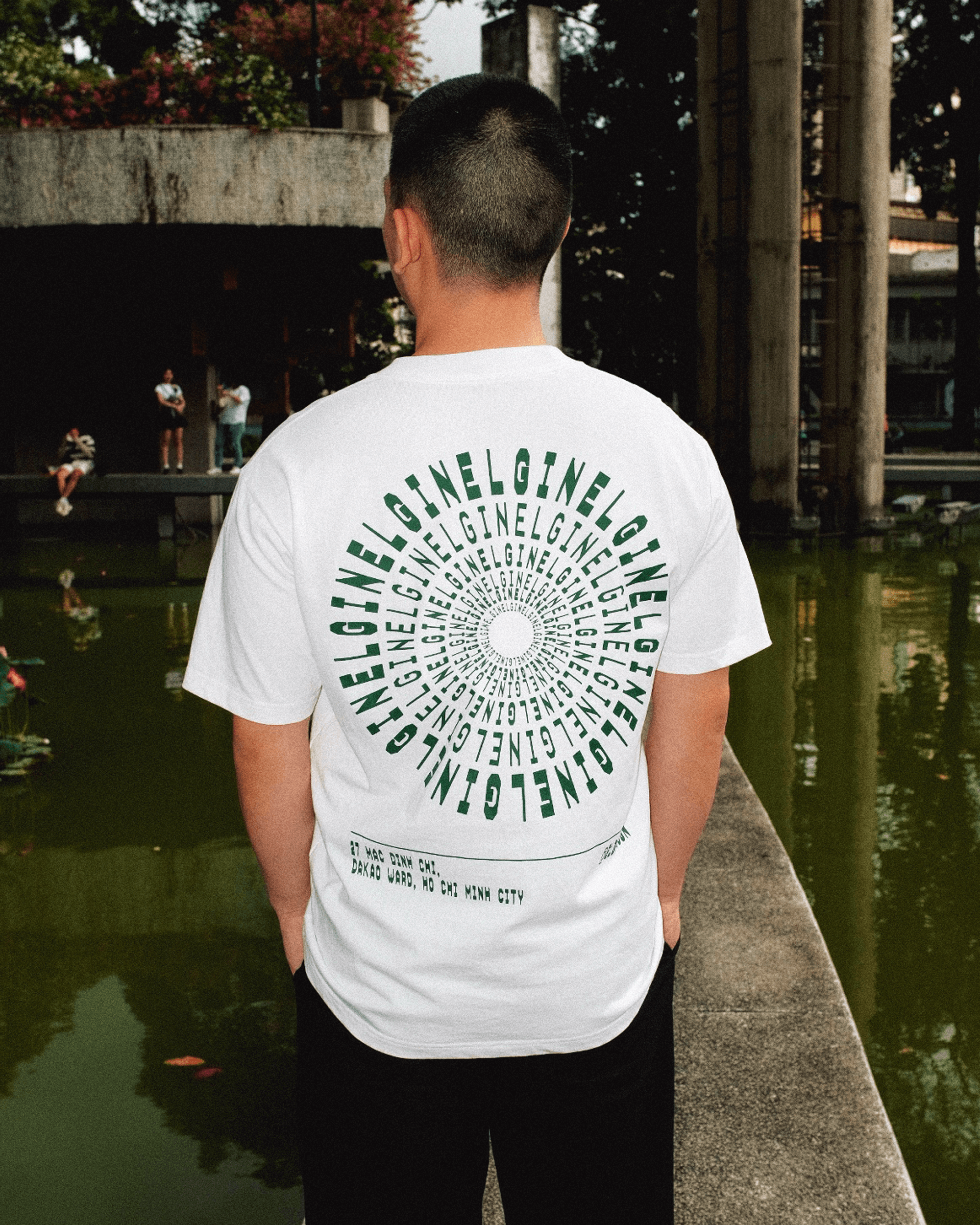
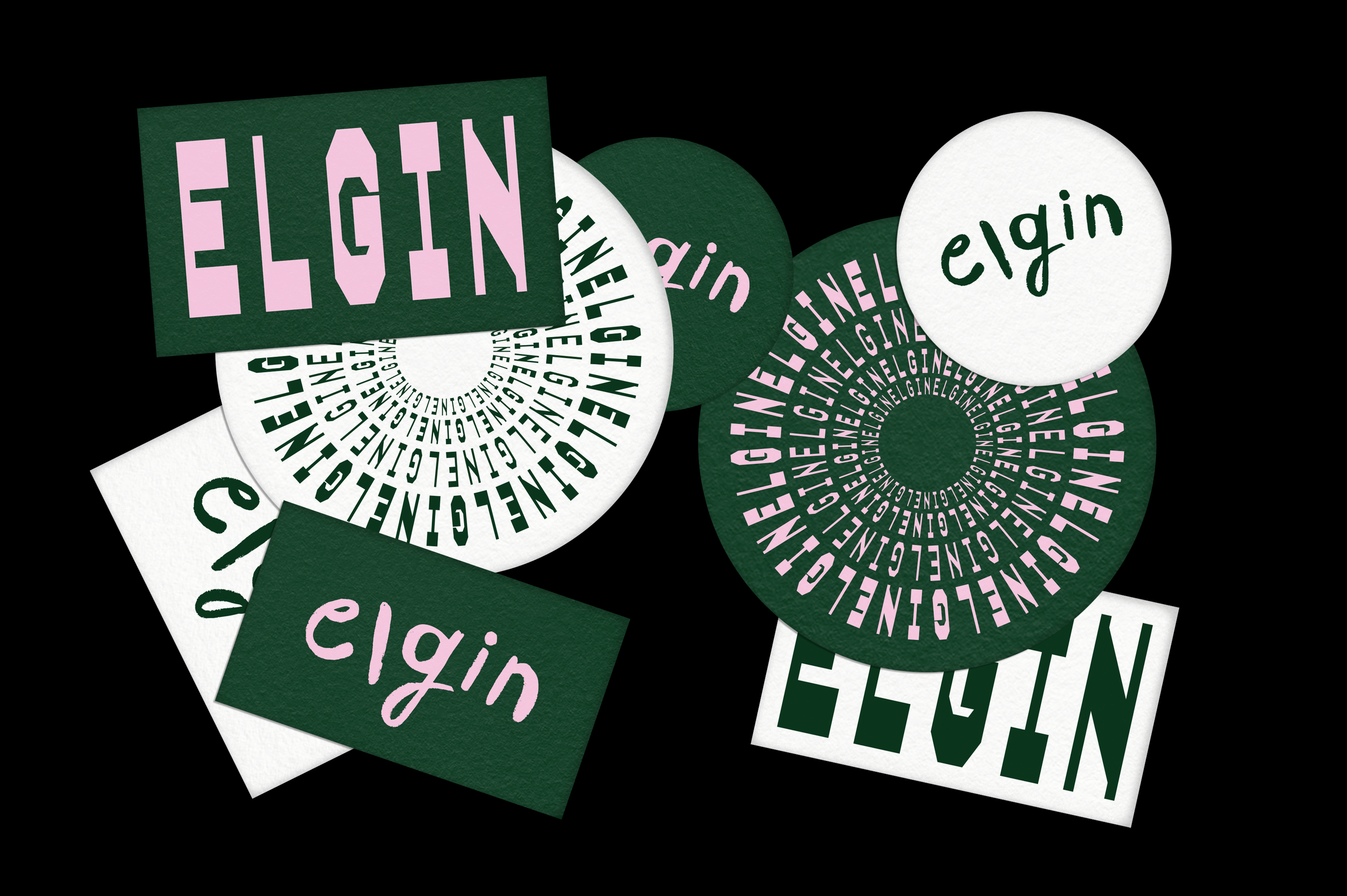
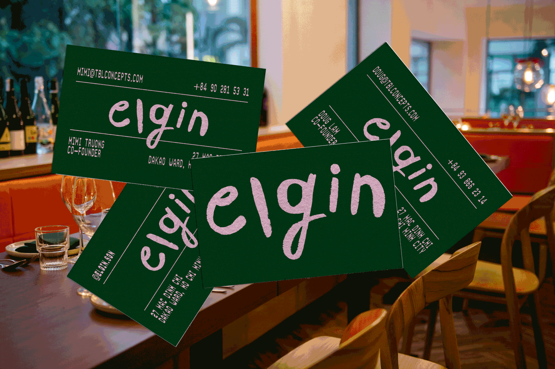
The logo features a straightforward, handwritten custom word mark designed to evoke the feel of a signature or a quick note. In contrast, the main typography draws inspiration from thermal printing used in receipts. The visual language is composed entirely of typographic elements, playfully experimenting with legibility by incorporating cues from printing errors—think repetition, stretching, and more. All of this is paired with an unconventional color palette of dark green and light pink, evoking both a sense of quality and playfulness, which is everything a visit to Elgin aspires to be.
CLIENT Elgin ROLE Graphic Designer & Creative Director
PHOTOGRAPHER Amanda Thơ Phạm YEAR 2024


WANT TO WORK WITH ME?
GET IN TOUCH!
© Davy Denduyver 2024